A Study in Software Engineering Progress
I’ve officially been a software engineer at Mixpanel for one year! For the full year, I’ve been tracking various time and Github data and I thought I’d share my results to start a conversation and be completely transparent about how engineers spend their time, and how some aspects of their code changes over time. You can skip the background and methodology if you wish by going directly to the Data or the Findings. You can also check out another version of this post using Mixpanel insights.
Some background: I started programming in 2014 in my junior year at UC Berkeley. While I was at school, I took a couple of courses in theory (CS 61A, CS 61B, CS 160, and CS 169), and outside of class I taught myself basic web development and worked on side projects (largely on my own). As one does when they first start out, my method of programming was to hack things together via StackOverflow until it worked.
While at Mixpanel, I realized I wanted to work full time as a software engineer. In January 2018, I was the first to go through an official path to engineering, and in April 2018 I became a full fledged software engineer. You can read about my full journey in ”Becoming a Software Engineer”.
I had a lot to learn as an engineer, and I still do. For one, the method I used for 4 years, hacking things together until they worked, doesn’t work for people who have worked on a relatively stable and mature codebase and know how to best write software for that codebase. I had to get rid of my JQuery habit, navigate Panel (a Javascript framework built by Mixpanel) for our new features, and learn how to write clean code that others would approve of.
Along the way, I wanted to ensure I was on the right track by logging my progress. It’s not an easy thing to quantify, but it’s something I think is necessary to concretely see improvement over time. I could gather time spent data and statistics from Github pull requests (PRs), and with that hopefully discover a personal “north star” metric that I would aim for every day towards engineering betterment.
Disclaimer: this is a purely data-driven perspective on progress. Aside from code quality and process, there are many factors that contribute to the success of an engineer, such as the way she solves problems, works with other engineers and project stakeholders, and takes feedback, and I wish I knew how to track or quantify those aspects. Not letting perfect be the enemy of good, I chose to track time spent and Github statistics because it was quantitative and it’s not something that has been documented before.
I understand that these are surface level metrics, but I hope the data on my own progress sparks a deeper discussion on what a “better” engineer means and what sort of data we can use to prove that and make it mainstream.
Methodology
After each PR was complete, I collected the following information in a Google Spreadsheet:
- Date information: month started, date started, date reviewed, and date pushed per PR
- Time spent: hours and workdays spent on pre-review, post-review, total number of workdays, total hours worked, and the total number of hours per day
- Ratio of pre-review vs post-review: “Pre-review” is the period of time in which I spend on beginning research and coding before asking others to review, while “post-review” is that which I spend incorporating comments and feedback from reviewers before shipping code to production
- Unique lines of code: lines of code added minus number of lines removed, or the total lines modified
- Number of comments
- Project information: project number, component, title, stack, framework used
Afterwards, I synthesized the data by taking these values and aggregating them into data by period, which is categorized by my engineering level and the project working on at the time, and by month.
I calculated the time spent in hours by using Google Calendar and recorded the time in which I started and stopped working on a certain PR. You can read more specifically on my method in my College Productivity Analysis. I used a single calendar called “coding”, and each event title constituted a PR. I included the typing of code, research, and brainstorms with coworkers into the time spent calculation for each PR. I also have other calendars, such as my main calendar (scheduling events with other coworkers), and tasks (writing documentation, doing HR tasks, deploying code, code reviews, etc).
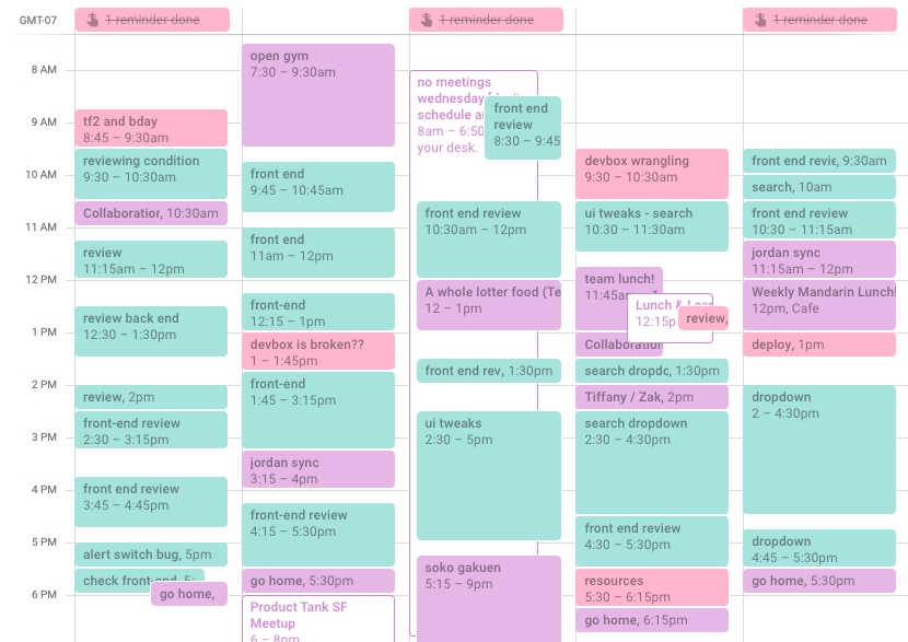
A typical week from March 2019.
The following are the different periods of my engineering, the first being my level and the second being the team or project:
- Engineering Path & SRFE: 20 work days, 1 month. Worked on small bug fixes before starting on my assigned task.
- Engineering Path & KEEP: 38 work days, 2 months. Joined a team where each member worked on separate unrelated projects. I worked primarily in Backbone during this time.
- L1 & KEEP: 43 work days, 2.5 months. After officially becoming a software engineer, I continued on the same team. L1 is a level reserved for internal transfers.
- L1 & D2: 77 work days, 4 months. Our team transitioned to work on a single product: dashboards. I worked primarily in Panel.
- L2 & D2: 27 work days, 2 months. I transitioned to L2 (new grad status) and continued to work on dashboards.
- L2 & AL: 70 work days (as of 3/27/2019), 3.5 months. Our team broadened scope, and I began working on a new product. I worked again primarily in Panel and python. The screenshot of the calendar above would fit into this period of time.
To become a better engineer
There are many facets to progress and being a better engineer, and at Mixpanel, we highlight technical ability, technical leadership, and teamwork, which are integrated into our leveling guide. For the sake of quantification (and since I’m still early in my career), I focus this analysis loosely on technical ability.
In terms of technical ability and code quality, the goal is to get a LGTM (“looks good to me”) on a significant PR and an approval to ship from a fellow colleague, or even better, a senior engineer. This single phrase shows that they approve of your process and code.
In an attempt to quantify my personal progress towards this goal, we’ll take a deep dive into the following points in the data I collected, which are the following:
- Pre-review and post-review time. How long do I spend before and after the review?
- Average working time. How long do I spend coding?
- Number of comments. How many comments do I get on average?
- Number of PRs and their cadence. How often do I deploy code to our codebase?
- Unique lines of code. How much code do I contribute? (This is by no means the way we evaluate or measure engineers at Mixpanel, but it was a piece of easy to get quantitative data that might be interesting to look at)
- Factor correlations. Can I use correlations to increase my chances of getting a LGTM?
Ultimately, I’m looking to determine whether I can use correlations between my time spent at Mixpanel and these statistics to increase my chances of getting a LGTM more quickly.
The Data
Below, I’ll go into more of the specifics of each bullet point I was interested that was contained in the methodology. The following data comes from 275 workdays (14 months), 182 PRs, 8,305 unique lines of code, and 1,271 comments.
Please note that while I took basic statistics in high school and in college, I do not have a background in data science. Thus, my analysis is limited to the lens of linear correlations and timescales.
Pre-Review and Post-Review
Here, I’m curious to see how long I spend in each type and whether or not the amount of time I’m spending on post-review is decreasing. If so, perhaps I’m improving! I’m also interested in whether the two have any correlation.
Sometimes pre-review time also includes time redoing a PR when a reviewer lets me know that I either created the wrong feature or have to change the overall approach to account for an extra detail. In this way the wording of this section is a little misleading--my primary goal for this ratio is to determine how much time it takes to refactor or address the comments of others on coding style or existing behavior, and if I started on the wrong foot or did not include something, I don’t feel that’s completely accurate in that representation. However, I do admit that moving some PRs’ post-review time into the pre-review time fudges the numbers a bit, and thus I advise to take this section with a grain of salt.
In general, you’ll see that the hours spent during pre-review per PR has gone down from its peak of 7.05 on the Eng Path to now of 3.9, as well as for post-review from its peak of 7.8 to 1.45 now. Average workdays during the pre-review have remained steady at around two, while post-review has gone down from 2.91 to 0.96. If we compare between projects (KEEP and D2), we’ll see that average hours and workdays decreased considerably.
Here’s the same graph but instead broken up in chunks of 20 workday cycles. Overall it follows the path as shown by the previous graph, except it’s more obvious where the peaks are. For example, the highest post-review period that overtook the pre-review in March 2018 was during Eng Path/KEEP. A second high post-review time was in August 2018, which was during L1/D2.
Is there a correlation between the hours of pre-review and post-review? Plotting all the data on a single graph, the coefficient of determination is 0.346, which suggests a positive moderate correlation between the two. Of course there are many outliers on this graph, such as the dot highest on post-review was a PR from Eng Path/KEEP and the one with the highest pre-review was from L1/KEEP.
Here’s the same graph with the outliers removed. I define an outlier through the interquartile ratio (IQR), the traditional way of calculating outliers. If any point is outside the lower and higher boundaries of the IQR*1.5 of Q1 and Q3, it is considered an outlier. This means that I’ve removed any PR with a pre-review greater than 12.6 hours and a post-review of 3.75 hours.
With these outliers excluded, the data is much more scattered with a coefficient of determination of 0.156. There’s a weak positive correlation between pre-review and post-review hours spent on a PR.
These numbers represent the PR that obtained the most number of hours during pre-review and post-review for each section. Both pre-review and post-review are decreasing, albeit post-review decreasing a bit more unstably. However, if we compare within projects (KEEP and D2), max post-review hours have definitely decreased.
Here’s a graph of the ratio between pre-review and post-review for every PR deployed in sequential order. If we drew a trendline for just KEEP and D2, you’d notice that the treadline trends upwards, suggesting an increasing pre-review ratio. As for AL, the line may be even, perhaps even trending downwards.
In terms of the ratio between pre-review and post-review, on average you’ll see that the ratio is increasing in favor of larger pre-review (58.71% in Eng Path/KEEP to 87.2% in L2/D2). Currently that number is 75.6% in L2/AL. It’s also increasing within KEEP (Eng Path to L1) and D2 (L1 to L2).
Here’s the same graph broken up by 20 workday cycles. Here we can see a clear delineation whenever a new period or project was started. In June 2018, I began D2, and continued to rise until the start of a new project in December 2018. From there, my ratio dropped to an average of 72%, and gradually increased again to 82%. Of course the numbers within Eng Path is lowest given I first started my assign tasks.
In summary: I spent fewer hours and workdays on both pre-review and post-review on average per PR (except post-review workdays remained steady). There is a weak positive linear correlation between the two as well. In addition, the first half of a project’s pre-review to post-review ratio is lower than the second half, and it could be for a number of reasons, such as getting used to a new project or that I’ve been given a harder task given my level increase. However, within a project the pre-review ratio increases, which does suggest an improvement.
Average Working Time
Here, I’m curious how long I’m spending per PR and per day. While more coding doesn’t necessarily correlate with better output (since more time could be an inefficiency and less time could mean I spend productive time on other tasks), it’s interesting to note these numbers.Note that items such as meetings, lunch, and non-coding projects are included in an average day but not on the “hours spent” number. Vacations and offsites are removed from the “day” number.
I have decreased the amount of hours worked per PR on average from 14.84 in Eng Path/KEEP to 5.35 in L2/AL, and also decreased slightly the amount of workdays from 2.12 in Eng Path/KEEP to 1.81 workdays in L2/AL per PR on average.
In terms of the hours spent per day on PRs, I spent the most in L2/D2 of 5.06 hours per day, while L2/AL was 3.98 hours per day. During the Eng Path, on paper I was spending 50% on Engineering and 50% on Support, which explains why I spent 1.23 hours per day during Eng Path/SRFE, but I must have focused more of my energy on engineering to have achieved an average of 4.24 hours during Eng Path/KEEP. Gradually I’ve increased the time spent on PRs, although the time in L2/AL is below trend.
Here’s the same graph broken out up 20 workday cycles. Interestingly, the same logic earlier applies to here: the start of a project shows a trough in time spent coding (July and December 2018), and then gradually increases. This could also be explained by the holiday season as well.
So, what did I spend my time on? I did some extra calculations and found the following:
- Meetings: 21 minutes per day (L1/D2) to 26 minutes per day (L2/AL)
- Code reviews: 5 minutes per day (L1/KEEP) to 10 minutes per day (L2/AL)
- Deploying: I didn’t get deploy access until in between L1 and L2. I spent 25 minutes per day (L2/D2) to 26 minutes per day (L2/AL) on deploying code to production.
- Fixing / improving devbox: During L2/D2, we were transitioning from Softlayer devboxes to GCP. I spent 10 minutes per day in L1/KEEP for Softlayer devboxes, 25 minutes when first transitioning (L2/D2), to 14 minutes in L2/AL in GCP.
- Other projects: 6 minutes per day (L1/D2) to 19 minutes per day (L2/AL)
- Opslead: I’m shadowing to become opslead, which is why it’s only a small sliver in L2/AL. This number will likely grow in the upcoming months.
Thus, I went from spending on average 5.16 hours per day in L1/KEEP to 6.52 hours per day in L2/D2, so overall the time I’m spending is increasing, especially through code reviews, other projects, deployment, and soon as opslead.
In summary: the amount of time spent on PRs and per day has decreased over time, but the amount of time I’m spending on average on work activities is increasing. Again, the time spent on coding initially is low during the first half of a new project (July 2018, December 2018), but gradually increases.
Number of Comments
I associate comments with feedback: the more comments, the more errors. Thus, if the number of comments decrease per PR, that could mean that I’m doing better. Note: some comments were expressed over Slack and thus were not captured in these numbers. In addition, some comments was my response to other comments, which could have inflated the numbers. Hopefully these numbers balances this out over time.
It looks like both the average number of comments per PR and the most comments in a single PR is decreasing, from 22.09 to 7.37 now, and from a whopping 99 to 36 now. If we compare within projects, we’ll see that average comments are decreasing, as well.
Here is the same graph broken up by 20 weekday periods. Again, it’s clear that the average comments decrease within projects. Interestingly there are more comments in July and August 2018, and in AL (December 2018 to March 2019) the comments continue to increase.
Out of curiosity, here’s the plot between the average hours worked in PR and average comments per PR broken up by 20 weekday periods. The correlation of determination is 0.682, which suggests that the data is strongly positively linearly correlated.
I also plot the number of hours worked per PR with the number of comments to see if there is a correlation between the two. The coefficient of determination is 0.598, which does suggest somewhat of a positive linear correlation between the two. There are still outliers here, such as the dot highest on post-review that was a PR from Eng Path/KEEP and the one with the highest pre-review was from L1/KEEP.
Here’s the same graph with the outliers removed. I’ve removed any PR with total hours worked that’s more than 16 hours and more than 21 comments. The coefficient of determination again has decreased to 0.363, which still suggests a bit of a positive linear correlation but definitely not as strong as with the outliers.
In summary: the number of comments is decreasing in general and within projects, which does suggest somewhat of an improvement (except in L2/AL). The amount of time and number of comments are somewhat linearly correlated as well, but averaged by month the numbers are strongly correlated. This makes sense because the more comments there are, the more time it takes to address the comments.
Number of PRs
We’ll take a look at PR cadence and PR code type.
The cadence of PRs has decreased from a PR every four days to a PR every 1.35 days. Again, I did not receive deploy access until L1, and so that could also be the reason for longer PR times in Eng Path. This time, if we compare within projects, we’ll see that the cadence lengthens slightly.
Here’s the same graph broken out up 20 workday cycles. This graph looks almost just like the comments graph, as the cadence decrease within projects but that it takes longer to deploy in July and August 2018 and in AL (December 2018 to March 2019).
Since the cadence graph and the comments graph broken up by 20 workday cycles looked so similar, I wanted to see what they look like together. The coefficient of determination is 0.259, which is considered weak. But, I’m not convinced.
Here’s the graph again without the January 2018 data point of 1.5 comments. The coefficient of determination is 0.931, which suggests that the number of comments and the larger the PR averaged out within a month is strongly positively correlated.
The type of PR could also have an influence as well. I first learned Panel in Eng Path/KEEP, which took me a while to grasp. Since then, I have had many more PRs over time, much of which is written in Panel.
In summary: I have deployed more PRs per week and fewer large PRs over time. In addition, the cadence between PRs and the number of comments within that PR are strongly positively correlated, which makes sense because the more comments left, the longer it takes to correct and deploy the PR. I’ve also coded more in Panel and less in Backbone.
Lines of Code
And now for contribution to our code base: how much code am I adding? Lines of code are not the way we measure or evaluate our engineers, nor are they by any means a good measure of progress, but it is fun to look at and see changes over time. Generally speaking, more lines of code is more output. Again the calculation is the number of lines added minus the number of lines removed. I understand that this could have been the number of lines added plus the number of lines removed, since removed code is also considered productive (if not better than adding code), however this would mean that lines with even the most miniscule changes (such as tabs) would count as double, which I don’t believe should be considered productive. Thus, I figured subtracting the two would be sufficient.
I define “large” PRs rather loosely: it must have more than 100 lines of code or have touched more than 30 files, but after that it’s a bit more subjective. For example, if I wrote a lot of test code, created a type.ts file, or much of the code was automatically generated, I don’t consider it a large PR.
In the above graph, you’ll see that the number of these large PRs has decreased over time, from 18.18% during my path to 5.77% now.
The average unique lines of code per PR fluctuates, from 50-80 lines in the first half of a project to 20 lines in the second half, much like the large PR chart.
Here again is a graph of the above broken up into 20 workday cycles. Lines of code is gradually increased over time, and again during projects (June 2018 and December 2018).
This graph mimics the average lines of code per day graph very closely. It could be that the few larger PRs were outliers that influenced the number lines added on average as well. 785 lines in a single PR in L1/D1?? I remember that PR being stressful from wrangling multiple features, which is why it existed. The 556 lined PR in L2/AL wasn’t as bad since it was mostly test code and written in python, while the other max PRs represented here are all written in Javascript. Overall, the max lines of code are increasing. Again, if we compare Eng Path/KEEP to L1/KEEP and L1/D2 to L2/D2, the lines of code do decrease within projects for both graphs.
The average unique lines of code per PR fluctuates, from 50-80 lines in the first half of a project to 20 lines in the second half, much like the large PR chart.
The coefficient of determination here is 0.555, which suggests that the total hours worked per PR and the amount of lines of code added is leaning towards strongly linearly correlated. Again there are more outliers, such as the 785 lined PR that took 53.5 hours to complete from L1/D2, and the 556 lined PR took 17.25 hours to complete from L2/AL.
Here’s the same graph with the outliers removed. Outliers are defined as the number of hours worked are above 16 and code added is fewer than -66 and more than 114. The coefficient of determination is 0.409, which suggests that the total hours worked per PR and the amount of lines of coded added are still moderately linearly correlated, but not as strong as initially thought.
Out of curiosity, I also plotted the lines of code with the comments per PR. The coefficient of determination is 0.211, which suggests a moderate linear correlation.
If we remove all the outliers, which is the lines of code fewer than -66 and more than 114 and the number of comments is above 21, the coefficient of determination is 0.175, which is even less correlated than with the outliers.
In summary: the unique lines of code are increasing in general and in projects, while the amount of larger PRs are decreasing. There is also a moderate positive linear correlation between the number of hours worked and the unique lines of code, and a much weaker correlation between amount of comments and unique lines of code.
Findings
Did I improve? Probably. It’s clear that there are fewer comments, more PRs deployed, and a higher ratio of pre-review to post-review in general and within projects, which does appear to be closer to the LGTM state. There were some fluctuations in accordance with the start of a new project, which suggests…
Starting new projects at first will look less productive than usual. When I start a project, within that month I average more comments per PR, less time spent, a lower pre-review ratio, and less code added to production. While correlation does not imply causation, perhaps this is because I’m researching or still figuring things out, which leads to PRs that have more comments and more non-PR work. However, over time when I’m in the zone or know what’s going on, these numbers all trend towards the positive.
There’s a weak positive correlation between hours of pre-review and post-review per PR. Just because I spend more time on a PR before submitting for review doesn’t necessarily mean that that PR will have a lower post-review time.
”Simple PRs” get code out faster, but that doesn’t necessarily mean ”small PRs”. When we look at the raw numbers rather than the averages by month from the above, the correlations between these amount of comments, lines of code, and hours spent per PR are weak to moderate at best, which suggests that it’s hard to define quantitatively what it means for a PR to be ”simple”. However, there’s a higher chance of simplicity if we break PRs up into smaller chunks, which allows reviewers to understand a larger whole piece by piece and catch things that might have otherwise be missed on a larger PR. This is a common practice at Mixpanel and something that we encourage all of our engineers to do.
As a full time engineer, I spent on average 5.85 hours per day on work and 5 hours on PRs for the past year. This means in a typical eight hour day, 73% of time is spent on work and 62% of time is spent on coding. For the past project, these numbers were 5.98 hours on work (meetings, code review, deploying, other projects) and 3.98 hours on coding. These numbers seem lower than expected, but because my tracking method involves retroactive time logs, unfortunately not everything was recorded precisely. For example, I did not log catching up on slack / email, PRs that were not deployed, lunch and breaks, and I might have forgotten to include a few spontaneous conversations.
If you’re honest with yourself, you don’t spend as much time as you think. Yes, on average 4-5 hours of coding per day and 5.85-6 hours per day working (excluding some factors that have fell through the cracks as mentioned above) is less than 8 hours. However, is it really possible to spend on average a full 8 hours a day coding without burnout? More time spent coding doesn’t necessarily correlate with better output: I should also spend time on code reviews, research, syncing up with coworkers, helping out engineers, being opslead, etc - this also makes better engineers. I should also better log time to more accurately represent how I spend my time: not just planned occurrences or time coding.
Data Improvements Going Forward
After I asked for my team to provide feedback on this post, I received input on my goals and what makes skilled engineers. I regret not talking to them sooner and asking them before I began to track. Here are some other quantitative metrics to track progress:
Time estimates. Most prominently is the fact that the more experienced an engineer, the better she is at estimating how long a task or project will take.
PR quality. While I wrote about PR length, lines of code, and number of comments, there are other factors to track that can make PRs great, such as the following:
- Did the PR provide context such as in-depth descriptions and inline comments?
- Was there a “draft PR” submitted beforehand as a way to check thought process?
- Were the commits separated out clearly?
- What kind of comments were received on a PR?
Task difficulty. I mentioned earlier that it would be great to also track difficulty as a way to be in step with the pre-review to post-review ratio, as ideally the pre-review ratio should increase for pull requests of similar difficulty and not necessarily for those that are more difficult or new.
Breaking down the pre-review. Finally, I’ve realized that my pre-review statistic did not encompass only the pre-review period, and I plan to break it up to account for different such as:
- Did I ask for help during the pre-review? How much time did I spend getting feedback?
- Time spent between a review to change my approach and the review after that changed approach
- Time to fix tests before ready for deploy
- Time to fix a deploy
Conclusion
I’ve learned a lot about software engineering over the past year, and there’s always more to learn. I definitely have a long way to go before I can create a significant PR with LGTM, but for now I’m pleased with the fact that there is progress.
One of my goals for this project was to find a personal “north star metric”, but even after all this data I wasn’t able to find a single source as there are so many factors that contribute to progress. For now, I will continue to track these numbers and distill them in a way that can hopefully lead to more insights. In addition, I plan to track time estimates, difficulty, and break down my original pre-review statistic so that I can have more accurate data. I also hope to leverage Github statistics to make useful insights across all of our engineers.
In the meantime, my action items to increase PR quality will be to:
- Continue to break up larger features into smaller PRs to decrease the complexity of the overall whole
- Ask for feedback early and often to ensure that the methodology is correct
What do you think about the data and the conclusions I’ve presented there? How would you track progress? I hope the article inspires someone out there to track their data and draw more conclusions that can help the engineering community.
Acknowledgements
Thank you to Aniruddha, Noj, Josh, Daniel, Chinmay, and Kristen for reading this behemoth and giving me great feedback.
Thank you to my team: Jordan, Josh, and Jing for putting up with my code and questions on a daily basis.
Thank you to Bernie, Robert, and Zak for believing in me and giving me the flexibility to pursue my own path.
Thank you to James for your inspiring words on logging time in calendars and productivity, which I use religiously to this day.
Thank you to Aria for planting the idea of programming in my head.
Thank you to Max, who started my first side project and taught me all about Django and Javascript web development.
Thank you to Andrew for encouraging me to continue to code and to never give up.
Thank you to everyone who read and shared “A college student’s individual analysis of productivity of four years” I wrote in 2016, which gave me the confidence to continue to create crazy projects like this.
Thank you to my parents for putting up with me and supporting my switch to software engineering even though it has nothing to do with my major. You are the best.